Often times I start accessory posts commenting on how intimidating the world of gaming accessories is. When you have hundreds of gaming headsets, every company makes five different mice, mousepads come in a wide variety of sizes, shapes, textures and even mechanics, yet it over discounts the fun involved. Unlike consoles, as important as performance is, there is a aesthetic value, which is what makes HyperX’s keycaps so much fun. Designed to bring out the beauty of your keyboard, do they make for a pleasing presentation or are you better off sticking with the stock ones?
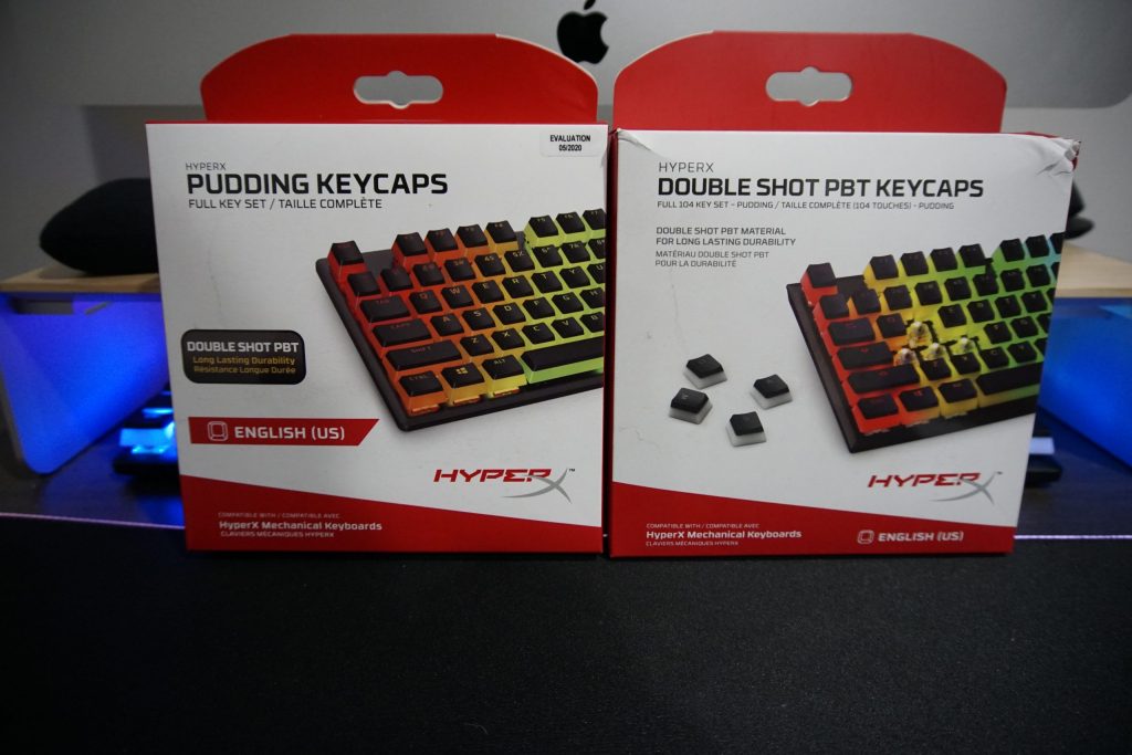
The first thing that stands out about the new HyperX Pudding Keycaps is changes in packaging. For many this might seem minor but HyperX did a fantastic job making things easier for the average consumer. While both the new and old sets are double shot PBT pudding keycaps, they put different emphasis on the actual features. Keyboard enthusiasts likely know double shot refers to how the keycap is made and PBT is the plastic used to make the key itself, they’re presented as elements that you probably should know before investing. Even though the new package features the terms, it chooses to highlight the pudding name, something the originals were also referred to as. Unlike the other terms, pudding simply refers to the look of the actual keycaps. Their look resembles that of traditional pudding, where there are two colors, with the second forming a small layer on top. In addition to changes in branding, the new version drops the full 104 key set terminology in favor of the far simpler full key set, essentially meaning if you have a keyboard with a number pad built-in, you’ll be able to replace every key. It makes things less intimidating and easier to just pick up, buy and enjoy.

While it’s clear the packaging is superior, let’s talk about the advantages of this keycap set. As previously mentioned, these are double shot PBT keycaps. Double shot simply refers to how the keys are constructed, with the advantage being icons that are part of the keycap itself. The other term, PBT, is a higher quality plastic that is resistant to shine. PBT keycaps also tend to have a rough texture, one that in my experience takes some getting used to, but I generally prefer. Think a stiffer fabric feeling. Both of these terms we covers in length in our previous review, which I strongly suggest checking out if you’d like additional information.
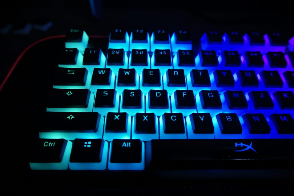
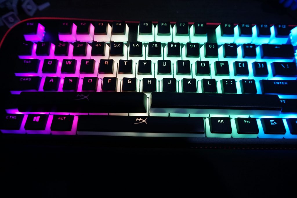
Since these keycaps obviously have a lot in common, it’s important to understand the two key differences. The new Pudding Keycaps allow more light to come through the keycaps and features a different font legend. Just doing a basic eye test, I struggled to notice a real difference in illumination. Both keycaps accentuate the RGB color effect, something that makes a substantial difference in a darker room. Seriously, if your end goal is to simply have a more durable set that maximizes the color effect, you’ll likely be very happy with either set.

Now, font seems like a relatively minor change that I strongly believe makes a substantial difference. Despite our original review not including it, the old font is a bit on the dated side and didn’t look at good as the stock keycaps in a number of ways. This set largely fixes this problem by using the same legend found on HyperX’s wide array of keyboards and can be seen in a couple distinct and obvious ways.
More observant readers might notice that tab, caps and shift are represented with icons on the old version and words on the new one. This also holds true for enter as well. Icons are also noticeably larger on the new set, making them easier to see and a bit more pleasing to look at. My favorite change is the font itself.

When you look at the original keycaps, several icons have a small break in them. This in it of itself isn’t bad, though it certainly looked like the type of “edgy” thing you’d expect from someone imaging gaming keycaps, but it actually highlighted the inherit illumination problems. With a single light illuminating every key, at least on the HyperX keyboard I have, there are often darker spots on top. Six, four, R, D and many others have this distinct look to them. A lot of the breaks seemingly coincide with the placement of the dark spots. As a result, I actually was more aware of it on the previous keycaps than the new one, simply because a slightly dimmer portion is not as distinct as solid black or white. Finally, HyperX decided to change the spacebar, a choice that may or may not make a difference for you. On the original set, space is represented by a simple flat bar, whereas the new set features the HyperX logo. However, regardless of how you feel about branding, due to the way this keyboard is illuminated, it is more pleasing having a largely black bar on top due to the aforementioned dimming. It actually stood out so much I replaced it with the original spacebar because it looked better.
HyperX Pudding Keycaps Review
In the grand scheme of things, the pudding keycaps are a relatively simple product that HyperX made more uniform. With the original set, you might get the illumination but the different font might be off-putting. The new one corrects this by essentially being the original set with higher quality plastic and the transparent pudding design. If this sounds like a great option, it’s actually a really solid set of keys and one well worth spending the time to swap over to. That being said, if you don’t like the original HyperX font or would prefer something a bit more reserved, this isn’t the product for you.
[Editor’s Note: HyperX Pudding Keycap was provided to us for review purposes.]
