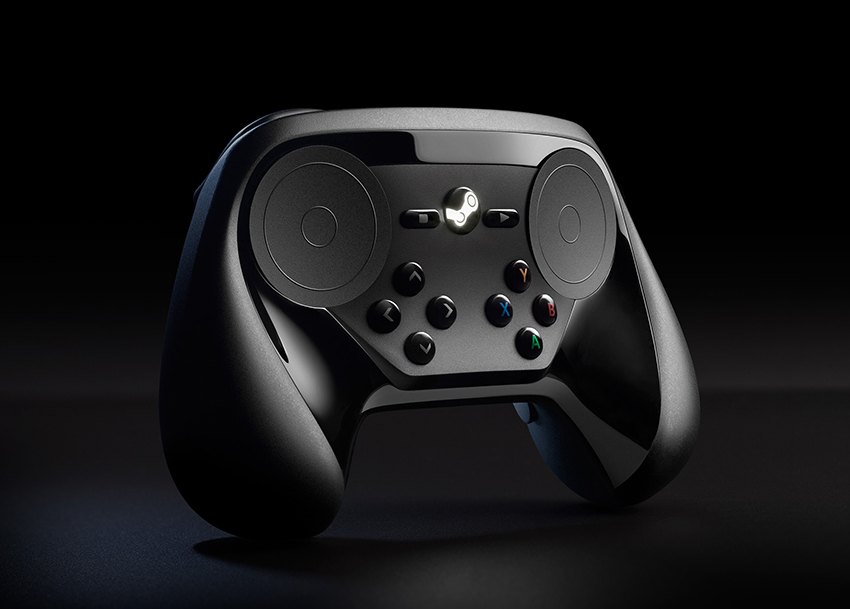
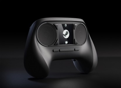
Valve has shown off their new redesign of their Steam Controller especially made for the Steam Box.
Based on the two images (the new one being the one at the beginning of this post) they have changed quite a few things. Instead of having a large Steam logo in the center they opted for a more PS Button-like in the center with Xbox-like start and select buttons to each side of it. The face buttons have also been re-distributed on the controller and resemble the Xbox mapping with a cozy little d-pad on the bottom right. It looks great but we will have to see how it feels and plays. What do you guys think of the redesign?


