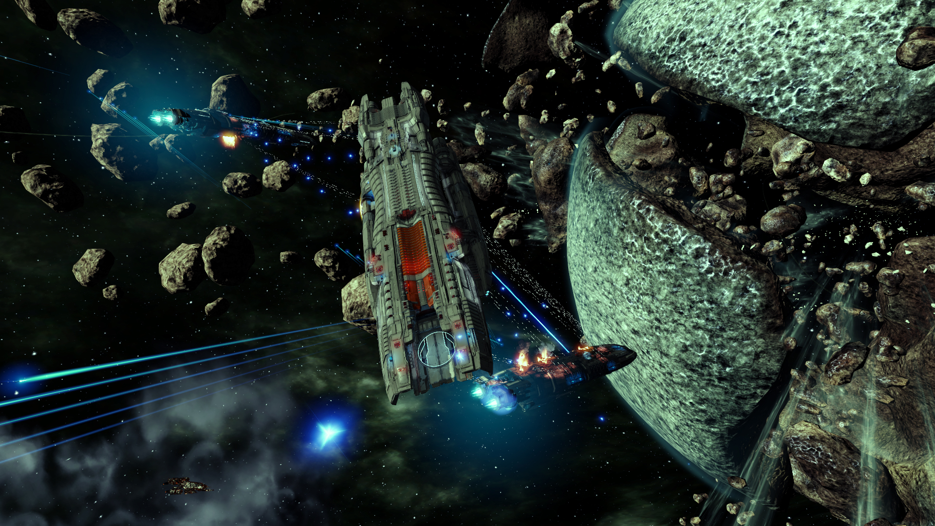
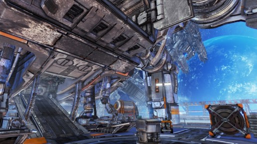
If there’s one thing that can’t be criticized with X Rebirth it’s the graphics when you’re in space. The backdrops of planets and various asteroid fields are arguably spectacular, and this is complimented by the frankly stunning space stations on show. While the graphical fidelity of the stations alone is impressive these are accompanied by literally hundreds of NPC ships constantly going about their business, with the numerous little shuttles dwarfed by the ever impressive larger ships. These big ships really shine, with even trading vessels looking fantastic, though that manages to become an annoyance in itself as all I was thinking was how much I’d rather be flying that trade ship or that capital ship. Combat looks great too, especially when multiple capital ships are involved, but in those situations you feel more like a spectator than anything, merely watching as the big buys slug it out.
Another nail in the coffin for X Rebirth is the user interface. Even the main menu is clunky, typically requiring you to double-click on menu options for no good reason. The worst element though is the radial menu tree which is the dominant method of control and interaction with the world. While a radial menu (think Mass Effect conversations) is great for individual decisions, especially if using a gamepad, a complex tree of radial menus with each option opening yet another wheel of options is a confusing and un-intuitive design. Stripping these out entirely and replacing them with a more traditional table of options would be my preference, or at least providing an optional UI where that’s implemented.
Trade and the economy have always been a strong feature of the X series, and on the whole this remains true. Setting up a trade is one of the few actions which doesn’t require you to land somewhere and talk to someone and is all the better for it, and one very cool feature is the way in which smaller tugs ferry cargo between your trade ship and the port. My only real complaint with this part of the game is that the UI could perhaps be a little more intuitive, but compared to the radial menus the trading menus are a beautiful thing.
All in all, X Rebirth is a great shame – there’s a great engine here with a lot of wonderful art assets, but a few strange bits of design direction bring it down. In this review I’ve tried to be constructive and I hope that changes like those I have suggested take place, at least in part. If Egosoft make good on their pledge to support the title then in a few months this may well be worth playing, but in its current state I simply can’t recommend that anyone buy this, especially with the current price tag of £40/$50/€50 (pricing which tremendously favors the dollar). If this had been sold as an early access alpha or beta release at half the price then it would be a much easier sell, but if you do decide to take the plunge then you need to be aware that this is effectively just that – unfinished.
[Editor’s Note: X Rebirth was reviewed on the PC. The game was provided to us by the publisher for review purposes.]


Bobo
November 26, 2013 at 4:21 AMSo it has nice graphics (if you totally ignore the interiors and NPCs and stations) and everything else is pretty bad.
And it still gets 49% of the points of a perfect game?
Seriously?
Jeffery
November 27, 2013 at 5:27 PMjust what does it take to get less of a score? is half the possible points just about looking good? BECAUSE THATS ALL IT HAS GOING FOR IT. And only in space.