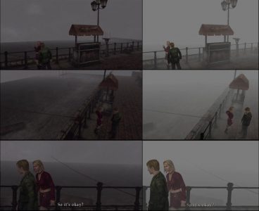
Masahiro Ito, art director for Silent Hill, was recently shown a screen shot comparison (which you can view below) to which he replied “Left side is HD, isn’t it? It’s poor…” He was in disbelief at first wondering of the game was an actual release stating “It’s really a released version? Really?” Upon being told this he stated that he was afraid that new players introduced to Silent Hill 2 and 3 via the HD collection would feel that the original games were just as bad. Here is the screen that a follower showed him:
The big difference between the two was the lack of fog effects in the HD collection screens on the left. With them missing, you can clearly see the edge of the game world which no one really wants to see when they are trying to get immersed in the experience.


