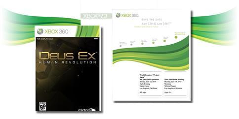
As some of you may know Microsoft will be altering the design of the Xbox 360 brand following what is suspected to be the unveiling of new hardware. The circlular patterns that we find on the Xbox 360 game cases and on the console’s home screen are about to be replaced. What is this new design? Take a look for yourself.
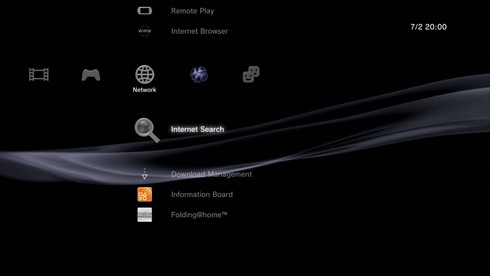
What do you think? Does it look familiar? Well I’ll tell you right now it is definitely triggering some similarities in my mind to another popular console’s layout. Playstation 3. Heard of it? I thought so. Every Playstation 3 owner has seen this iconic pattern floating in the background of their XMB upon startup. Just in case you have a custom background/theme here’s a pic of the default theme to refresh your memory.
Let’s change the primary color to green and we have twins! Okay maybe not twins, but they are very close. It’s kind of like how that creature from the movie Splice looks a lot like Britney Spears when she went crazy and shaved her head. Now I’m not saying Microsoft went out and stole their design from Sony, but it is interesting to see them arriving at this decision for their new look. Maybe they felt like switching roles for a while and soon PS3 owners will see the PSN orb icon floating in the bottom right corner of the screen with circles emanating from it. Hopefully you’ve realized that I’m joking. Leave a comment letting us know what you think of Microsoft’s change…or go on about the conspiracies as usual. Have at it fanboys!


CHRIS117 DELGAD
June 8, 2010 at 10:59 AMI’m pretty sure the box arts with the new Wave design mean they are Natal capable.